微信小程序开发教程(5)- 小程序组件使用详解
一、小程序中组件的分类
小程序中的组件也是由宿主环境提供的,开发者可以基于组件快速搭建出漂亮的页面结构。官方把小程序的组件分为了9大类,分别是:视图容器、基础内容、表单组件、导航组件、媒体组件、map地图组件、canvas画布组件、开放能力、无障碍访问。
二、常用的视图容器组件
1、view组件
普通视图区域组件,类似于html中的div,是一个块级元素,常用来实现页面的布局效果。
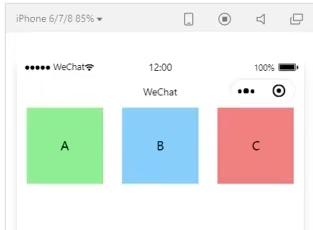
实现上图布局代码如下:
<view class="container">
   <view>A</view>
   <view>B</view>
   <view>C</view>
</view>
wxss代码如下:
.container view {
  width: 100px;
  height: 100px;
  text-align: center;
  line-height: 100px;
}
.container view:nth-child(1){
  background-color: lightgreen;
}
.container view:nth-child(2){
  background-color: lightpink;
}
.container view:nth-child(3){
  background-color: lightskyblue;
}
.container {
  display: flex;
  flex-direction: row;
  justify-content: space-around;
}
2、scroll-view组件
可滚动的视图区域,常用来实现滚动列表效果。
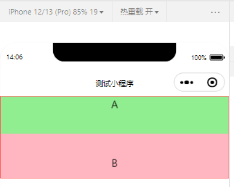
实现上图布局代码如下:
<scroll-view class="container" scroll-y>
  <view>A</view>
  <view>B</view>
  <view>C</view>
</scroll-view>
.container view {
  height: 100px;
  text-align: center;
  line-height: 100px;
}
.container view:nth-child(1){
  background-color: lightgreen;
}
.container view:nth-child(2){
  background-color: lightpink;
}
.container view:nth-child(3){
  background-color: lightskyblue;
}
.container {
  border: 1px solid red;
  height: 140px;
}
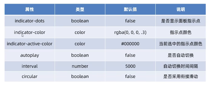
3、swiper和swiper-item组件
轮播图容器组件和轮播图item组件。常用属性如下:
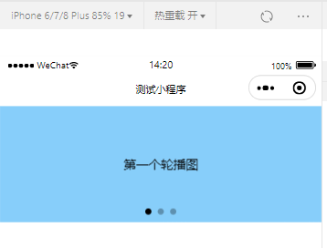
实现上图布局代码如下:
<swiper class="swiper-container" indicator-dots>
  <swiper-item>
    <view class="item">第一个轮播图</view>
  </swiper-item>
  <swiper-item>
    <view class="item">第二个轮播图</view>
  </swiper-item>
  <swiper-item>
    <view class="item">第三个轮播图</view>
  </swiper-item>
</swiper>
.swiper-container {
  height: 150px;
}
.item {
  height: 100%;
  line-height: 150px;
  text-align: center;
}
swiper-item:nth-child(1) .item {
  background-color: lightskyblue;
}
swiper-item:nth-child(2) .item {
  background-color: lightcoral;
}
swiper-item:nth-child(3) .item {
  background-color: ightgoldenrodyellow;
}
三、常用的基础内容组件
1、text组件
文本组件,类似于html中的span标签,是一个行内元素。
通过text组件的sekectable属性,实现长按选中文本内容效果。
<view>
  手机号码支持长按选中效果。
  <text selectable="true">19800088888</text>
</view>
2、rich-text组件
富文本组件,支持把html字符串渲染为wxml结构。
通过rich-text组件的nodes属性节点,把html字符串渲染为对应的ui结构。
<rich-text nodes="<h1 style='color:red'>标题</h1>"/>
四、其他常用组件
1、button组件
按钮组件,功能比html中的button按钮丰富,通过open-type属性就可以调用微信提供的各种功能,如客服、转发、获取用户授权、获取用户信息等。
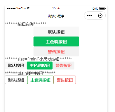
实现上图按钮效果代码如下:
<view>*******按钮实例*******</view>
<button>默认按钮</button>
<button type="primary">主色调按钮</button>
<button type="warn">警告按钮</button>
<view>*******size="mini"小尺寸按钮*******</view>
<button size="mini">默认按钮</button>
<button size="mini" type="primary">主色调按钮</button>
<button size="mini" type="warn">警告按钮</button>
<view>*******plain镂空按钮*******</view>
<button size="mini" plain="true">默认按钮</button>
<button size="mini" plain="true" type="primary">主色调按钮</button>
<button size="mini" plain="true" type="warn">警告按钮</button>
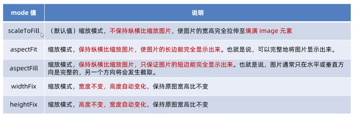
2、image组件
图片组件,image组件默认宽度约300px、高度约240px。image组件的mode属性用来指定图片的裁剪和缩放模式,常用的mode属性值如下:
<image></image>
<image src="/images/1.png" mode="aspectFit"></image>
3、navigator组件
页面导航组件,类似于html中的a链接。
猜您可能还喜欢
- 微信小程序开发教程(3)- 小程序项目目录结构及页面构成详解(470)
- 微信小程序开发教程(8)- 小程序flex布局详解(408)
- 分享一款免费的微信群活码、QQ群活码平台、短链平台-畅联活码(402)
- 微信小程序开发教程(7)- 小程序中的事件绑定(396)
- 微信小程序开发教程(4)- 微信小程序页面wxml模板文件、wxss样式文件详解(390)
- 微信小程序开发教程(5)- 小程序组件使用详解(386)
- 微信小程序开发教程(6)- 小程序中的数据绑定(379)
- 微信小程序开发教程(1)- 开发环境搭建(378)
- 微信小程序开发教程(2)- 创建小程序项目(376)
- 微信小程序开发教程(5)- 小程序API使用详解(370)
评论列表
发表评论

文章分类
文章归档
阅读排行
- 1. Windows Server 2008 R2永久激活及Chew-WGA v0.9下载(13665)
- 2.Visual Studio 2017中安装visualSVN及使用详解(5435)
- 3.完美解决iis下JWplayer提示Error loading media: File could not be played错误(4228)
- 4.asp.net mvc+jquery easyui开发基础(一)模块首页及增加、修改、删除模块实现(3631)
- 5.Android avax.net.ssl.SSLPeerUnverifiedException: No peer certificate 解决方法(httpClient支持HTTPS的访问方式)(3449)
- 6..Net Mvc中使用Jquery EasyUI控件讲解(一)表格控件datagrid使用介绍(3169)
- 7.asp.net mvc+jquery easyui开发实战教程之网站后台管理系统开发(七)权限管理模块之系统菜单动态生成(3094)
- 8.asp.net mvc+jquery easyui开发实战教程之网站后台管理系统开发(三)登录模块开发(3063)
- 9.asp.net mvc+jquery easyui开发实战教程之网站后台管理系统开发(八)权限管理模块之权限管理实现(2702)
- 10. asp.net mvc+jquery easyui开发实战教程之网站后台管理系统开发(六)权限管理模块之初始数据准备(2644)